
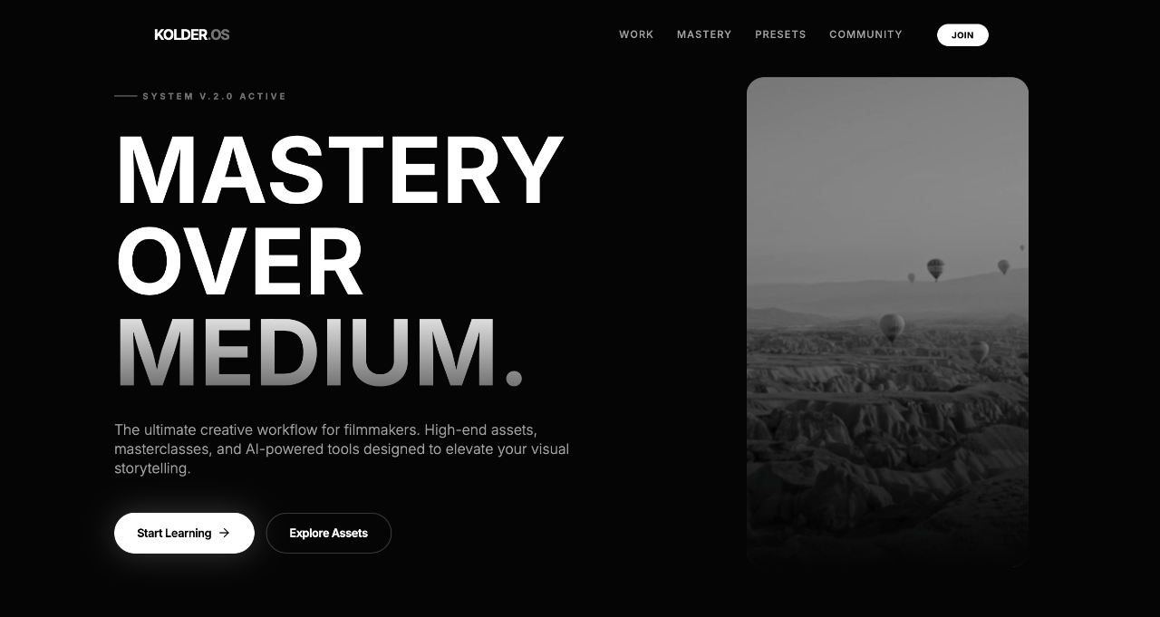
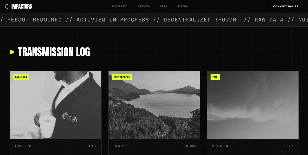
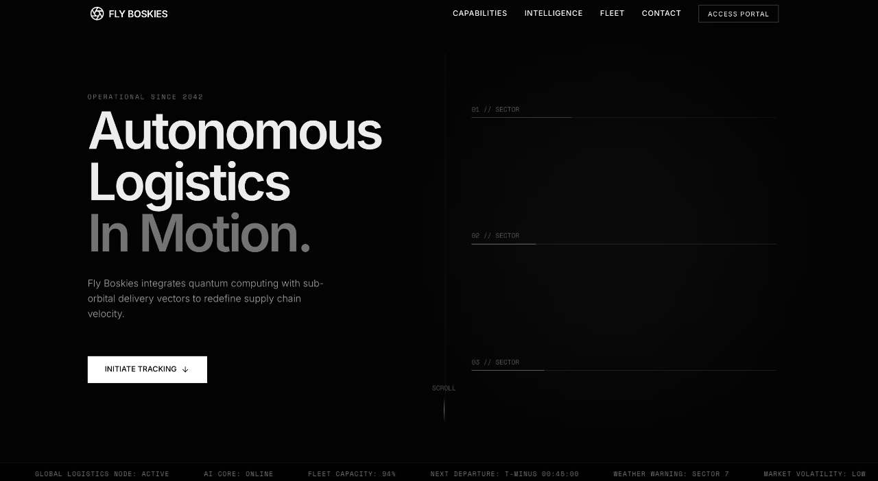
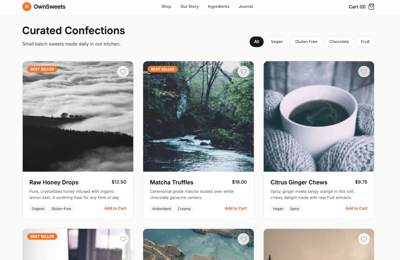
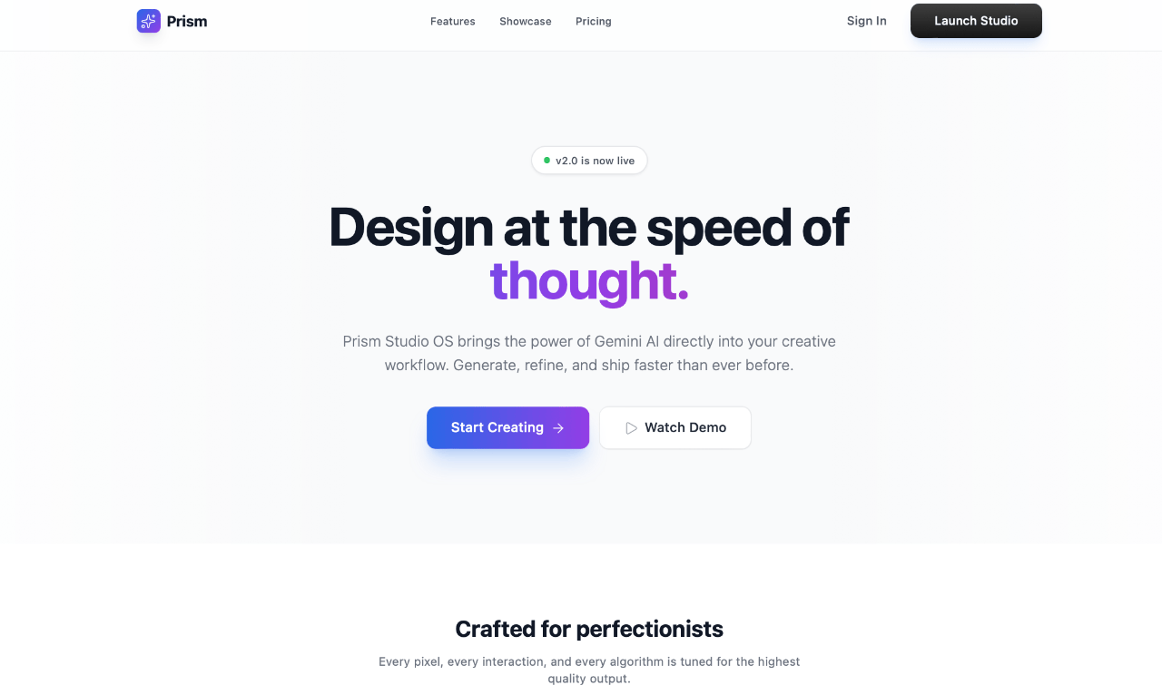
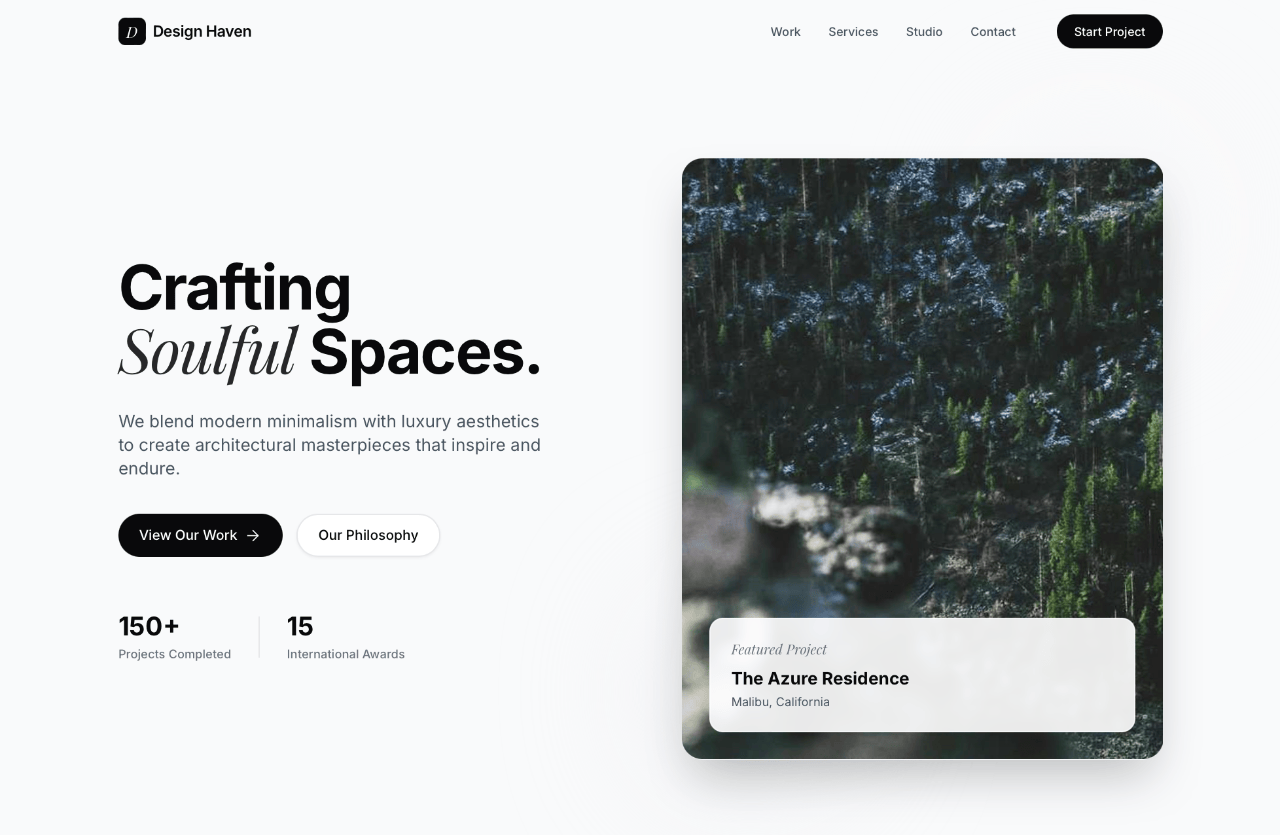
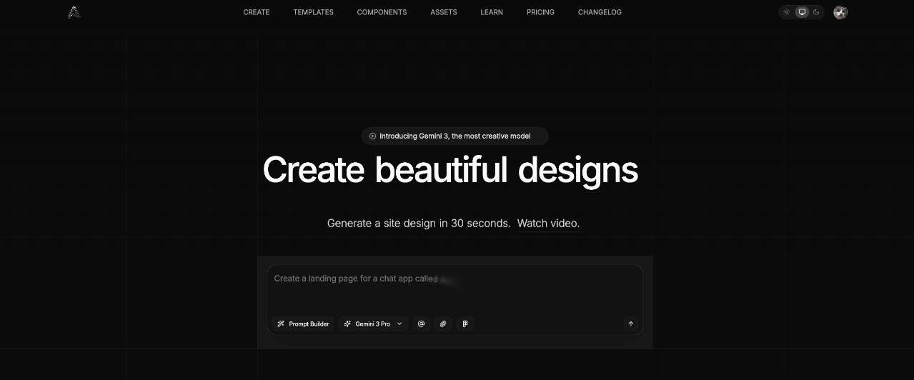
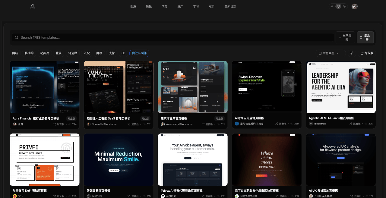
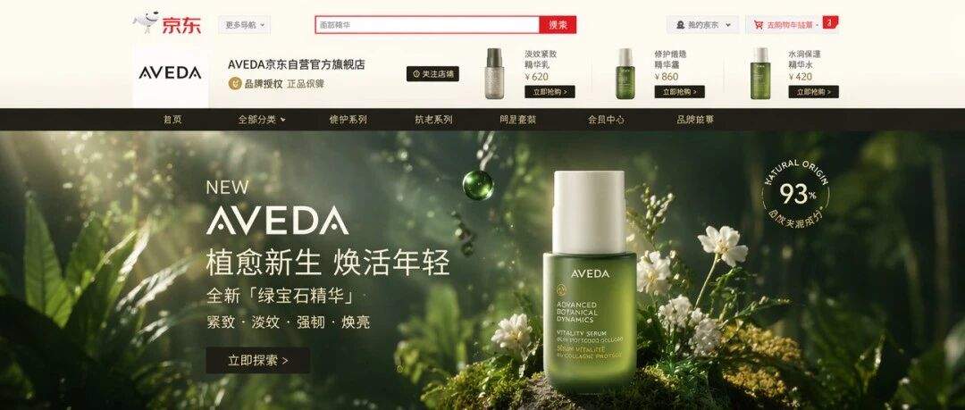
 大家好,最近团长给我分享一个利用 Gemini 3 生成较好的动态网页设计助手 Aura,用 Gemini 3 生成动态网页真的不错,作为参考用绝对是利器。下面我用该网站提示生成的网页:


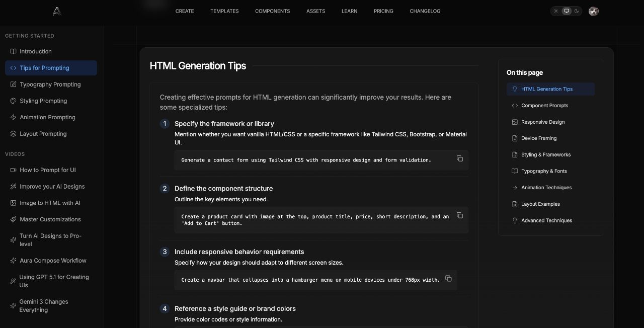
一.提示词技巧
创建有效的 HTML 生成提示可以显著提高生成结果。以下是一些实用技巧:
1.指定框架或库
请说明您想要使用纯 HTML/CSS 还是特定的框架,例如 Tailwind CSS、Bootstrap 或 Material UI。
Generate a contact form using Tailwind CSS with responsive design and form validation.--2.定义组件结构
列出你需要的关键要素。
Create a product card with image at the top, product title, price, short description, and an 'Add to Cart' button.o Cart' button.--3.包括响应行为要求
具体说明您的设计应如何适应不同的屏幕尺寸。
Create a navbar that collapses into a hamburger menu on mobile devices under 768px width.--4.参考风格指南或品牌颜色请提供颜色代码或款式信息。
Use the color palette #3A86FF (primary), #FF006E (accent), and #FFFFFF (background) with rounded corners (8px radius).ed corners (8px radius).--5.提及交互元素请描述任何动画或特效。
Include a hover effect that scales the card by 1.05x and adds a subtle shadow when users hover over the product.ow when users hover over the product.--6.提供参考或灵感指出现有设计。
Create a testimonial section similar to those on Airbnb's homepage with avatar, quote, and customer name.name.二.组件提示
使用这些示例提示作为常见 UI 组件的模板:
1.首屏
Generate a modern hero section for a SaaS product with Tailwind CSS. Include a headline, subheading, CTA button, and a floating mockup image on the right side. Make it fully responsive.
--2.价格表
Create a 3-tier pricing table with Tailwind CSS. Each card should have a plan name, price, feature list with checkmarks, and a signup button. Highlight the recommended plan and make it responsive.
--3.导航栏
Design a sticky navigation bar with logo on left, navigation links in center, and login/signup buttons on right. Make it collapse to a hamburger menu on mobile, with a smooth slide-in animation.
--4.客户评价卡
Create a testimonial section with 3 cards in a row. Each card should have a customer image, quote, name, and position. Use a clean design with subtle shadows and rounded corners. Add a star rating at the top of each card.
三.响应式设计
为响应式设计编写有效的提示语:
1.指定断点
明确定义布局何时需要更改。
Create a layout that switches from 3 columns on desktop (1024px+) to 2 columns on tablet (768px to 1023px) and 1 column on mobile (below 768px).
--2.描述移动设备特有的行为
详细说明各元素应如何调整。
On mobile, the navigation menu should collapse into a hamburger icon that, when clicked, reveals a full-screen overlay menu with a close button in the top-right corner.
--3.优先考虑移动端内容
解释哪些内容最重要。
On mobile, prioritize the sign-up form by placing it above the feature list. On desktop, display them side-by-side.
--4.指定触控友好元素
请提供适合触摸界面的尺寸。
Make all buttons at least 44px tall on mobile for better touch targets, with 16px spacing between interactive elements.
--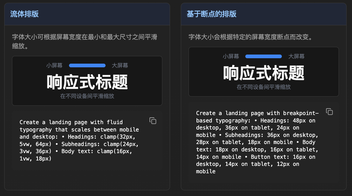
Create a landing page with fluid typography that scales between mobile and desktop: • Headings: clamp(32px, 5vw, 64px) • Subheadings: clamp(24px, 3vw, 36px) • Body text: clamp(16px, 1vw, 18px)
Create a landing page with breakpoint-based typography: • Headings: 48px on desktop, 36px on tablet, 24px on mobile • Subheadings: 36px on desktop, 28px on tablet, 18px on mobile • Body text: 18px on desktop, 16px on tablet, 14px on mobile • Button text: 16px on desktop, 14px on tablet, 12px on mobile
四.样式和框架
如何在提示中指定样式和框架: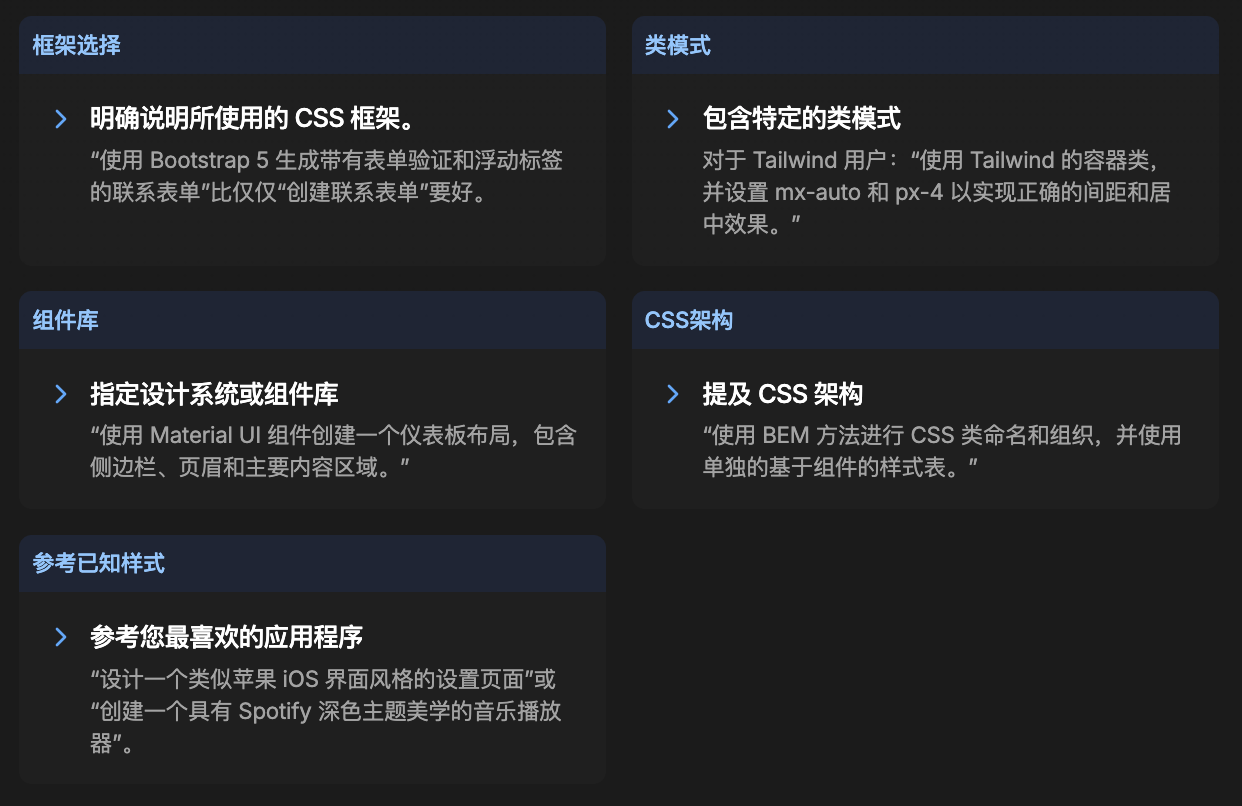
1.视觉层级
如何对元素进行优先级排序和组织,以引导用户注意力。
Create a card component with clear visual hierarchy: large title, medium subtitle, small body text, and a prominent call-to-action button using size, color, and spacing to establish importance.
--
2.样式类型选择
选择与您的品牌和目标相符的整体视觉风格。
Design a dashboard with glassmorphism style using backdrop blur, subtle transparency, and soft shadows to create depth while maintaining a modern, premium feel.
--
3.色彩心理学
巧妙运用色彩来影响情绪和行为。
Create a financial app interface using blue as the primary color to convey trust and stability, with green for positive values and red for negative values or warnings.
--
4.可访问性和对比度
确保设计能够满足所有用户的需求,并具有适当的对比度和语义含义。
Design a form with WCAG AA compliant contrast ratios (4.5:1 minimum), clear focus states, and semantic color usage that doesn't rely solely on color to convey information.--
5.示例提示
现代SaaS仪表盘
Create a modern SaaS dashboard with glassmorphism design using an adaptive theme that responds to system preferences. Use blue (#3B82F6) as the primary accent color with subtle large shadows for depth. The background should be white in light mode and dark gray (#111827) in dark mode, with light gray borders (#E5E7EB) that adapt to neutral borders (#374151) in dark mode. Design should be optimized for desktop screens with larger elements and detailed hover states. Use the modern color palette for consistency with supporting colors of gray-100, gray-800, and blue-600. Ensure the design is professional, accessible with WCAG AA compliance, and follows current UI/UX best practices with proper contrast ratios and responsive behavior. Include subtle micro-interactions and smooth transitions between states.-
移动优先的电子商务应用
Design a mobile-first e-commerce app interface with iOS-style design using rounded corners and medium shadows. Use a light theme with green (#10B981) as the primary accent color for trust and growth associations. Apply medium shadows for depth and hierarchy. The background should be white with gray borders for clean separation. Design should be optimized for mobile devices with large touch targets (44px minimum), single-column layouts, and thumb-friendly navigation. Use the earth color palette for warmth with supporting colors including amber-600, orange-500, and green-700. Ensure the design feels native to iOS users with proper spacing, readable typography, and accessible color contrast ratios above 4.5:1. Include loading states, error handling, and success feedback with appropriate semantic colors.-
创意作品集网站
Create a creative portfolio website with brutalist design using bold, raw, and geometric elements. Use a dark theme with purple (#8B5CF6) as the primary accent color to convey creativity and luxury. Apply dramatic extra-large shadows for maximum visual impact and artistic flair. The background should be black with high-contrast white borders for bold separation. Design should be optimized for desktop screens with artistic layouts and experimental navigation patterns. Use the vibrant color palette for creative energy with supporting colors including purple-500, pink-400, yellow-400, and green-400. Ensure the design is memorable and artistic while maintaining basic accessibility standards. Include bold typography, asymmetrical layouts, and striking visual elements that showcase creative work effectively.https://wxa.wxs.qq.com/tmpl/op/base_tmpl.html-
极简博客平台
Design a minimalist blog platform with flat design using clean, solid colors and no shadows for maximum readability. Use a light theme with gray (#6B7280) as the primary accent color for sophisticated neutrality. Apply no shadows to maintain the clean, distraction-free aesthetic. The background should be white with subtle gray borders for gentle content separation. Design should be optimized for all devices with responsive typography and flexible layouts. Use the monochrome color palette for elegant simplicity with supporting colors of gray-900, gray-700, gray-500, and gray-300. Ensure the design prioritizes content readability with excellent typography hierarchy, generous white space, and WCAG AAA contrast compliance. Focus on clean lines, ample spacing, and distraction-free reading experience with subtle interactive elements.-
金融科技应用
Create a financial technology app with Material Design using elevation and depth principles. Use an adaptive theme with blue (#3B82F6) as the primary accent color to convey trust and stability. Apply medium shadows for clear hierarchy and professional appearance. The background should adapt between white and dark gray based on user preference, with borders that maintain proper contrast in both themes. Design should be optimized for tablet devices with medium-sized touch targets and flexible grid layouts. Use the ocean color palette for trustworthiness with supporting colors including blue-900, blue-700, cyan-500, and teal-400. Ensure the design meets financial industry standards for accessibility and security perception. Include clear data visualization, secure interaction patterns, and professional micro-interactions that build user confidence.-
游戏社区平台
Design a gaming community platform with neumorphic design using soft, extruded plastic-like appearance for a tactile, engaging feel. Use a dark theme with orange (#F97316) as the primary accent color for energy and excitement. Apply subtle small shadows with inner shadows for pressed effects on interactive elements. The background should be dark gray with matching borders for seamless integration. Design should be optimized for desktop screens with gaming-focused layouts and immersive navigation. Use the sunset color palette for dynamic energy with supporting colors including orange-500, red-500, pink-500, purple-500, and yellow-400. Ensure the design appeals to gaming audiences with high contrast for visibility during gameplay, customizable themes, and engaging visual feedback. Include animated elements, achievement displays, and community features that enhance the gaming experience.
五.排版与字体
如何在提示中指定样式和框架:
在提出设计需求时,请具体说明字体偏好,包括字体系列、字重、字号、行高和字间距。这可以确保界面上的文本保持一致、易读且美观。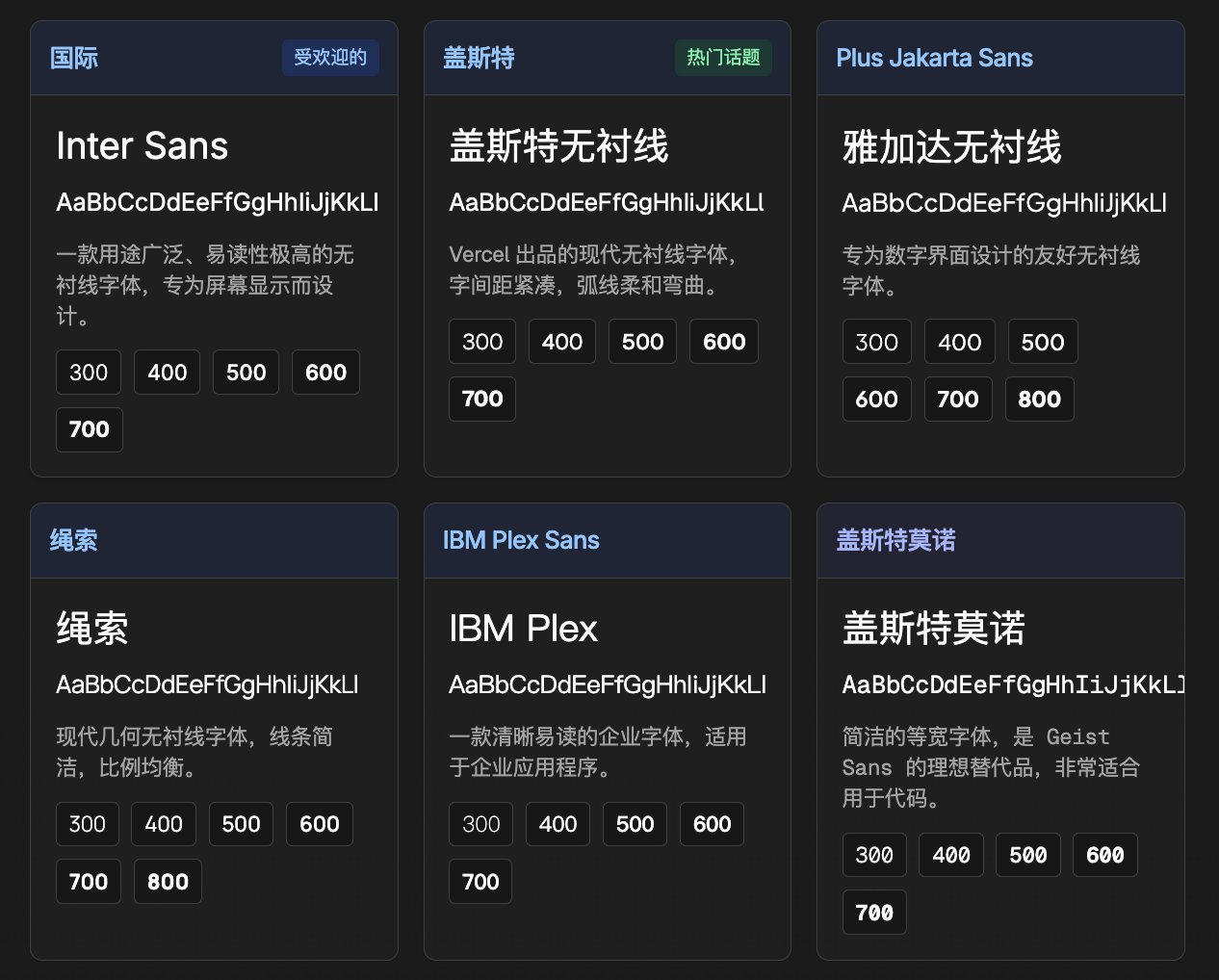
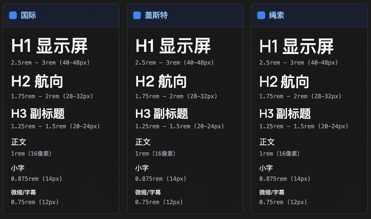
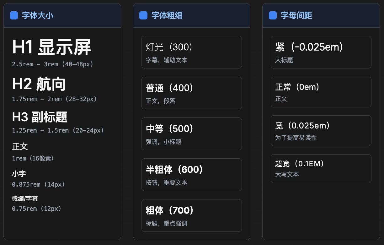
1.分类对比
将不同类别的字体配对使用(衬线字体 + 无衬线字体,标题字体 + 无衬线字体)。
Use Playfair Display for headings and Inter for body text
--
2.重量对比
使用同一系列的字体时,要通过显著的字重差异来营造对比效果。
Use Inter Black (900) for headings and Inter Regular (400) for body text
--3.尺寸对比
通过标题和正文之间显著的字号差异,创造视觉趣味。
Set headings to 3rem (48px) and body text to 1rem (16px)
--4.历史或风格上的联系
选择具有共同历史时期或设计美学风格的字体进行搭配。
Create a mid-century modern design using Futura for headings and Gill Sans for body text
--
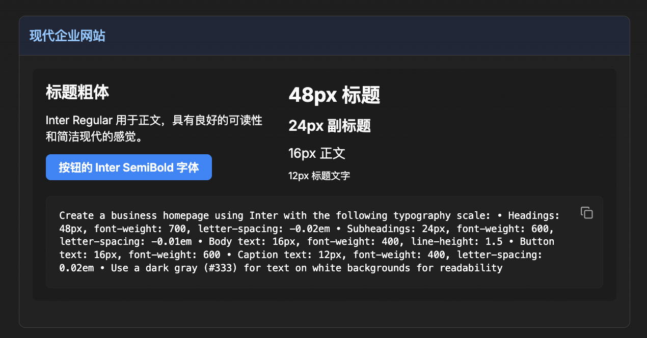
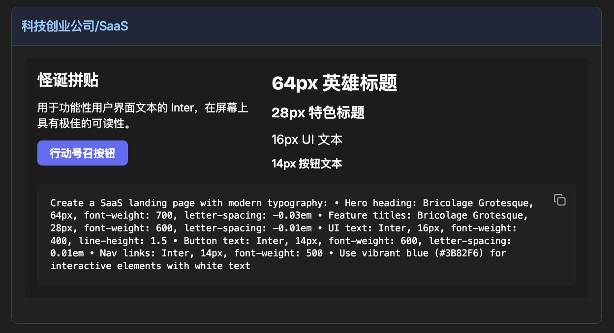
生成的提示:Create a landing page using Inter font with the following typography scale:
Headings: 40-60px, font-weight: 640, letter-spacing: -0.06em
Subheadings: 28-36px, font-weight: 560, letter-spacing: 0.00em
Body text: 14-16px, font-weight: 460, line-height: 1.5
Button text: 14px, font-weight: 560
Ensure proper contrast and hierarchy between text elements
--
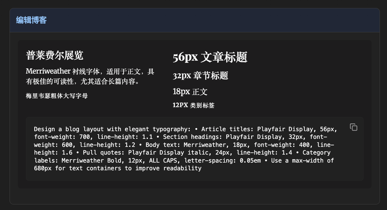
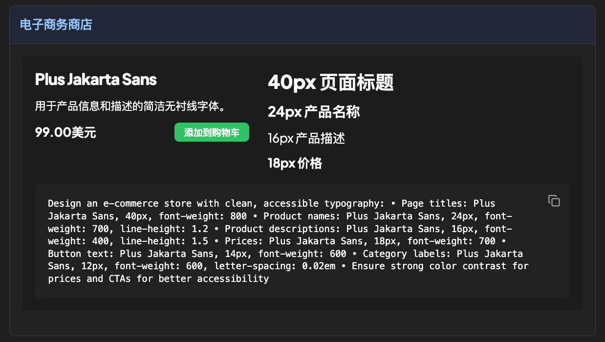
Design an e-commerce store with clean, accessible typography: • Page titles: Plus Jakarta Sans, 40px, font-weight: 800 • Product names: Plus Jakarta Sans, 24px, font-weight: 700, line-height: 1.2 • Product descriptions: Plus Jakarta Sans, 16px, font-weight: 400, line-height: 1.5 • Prices: Plus Jakarta Sans, 18px, font-weight: 700 • Button text: Plus Jakarta Sans, 14px, font-weight: 600 • Category labels: Plus Jakarta Sans, 12px, font-weight: 600, letter-spacing: 0.02em • Ensure strong color contrast for prices and CTAs for better accessibility
六.动画技术
利用这些动画技巧增强您的用户界面,让设计栩栩如生:
1.文字动画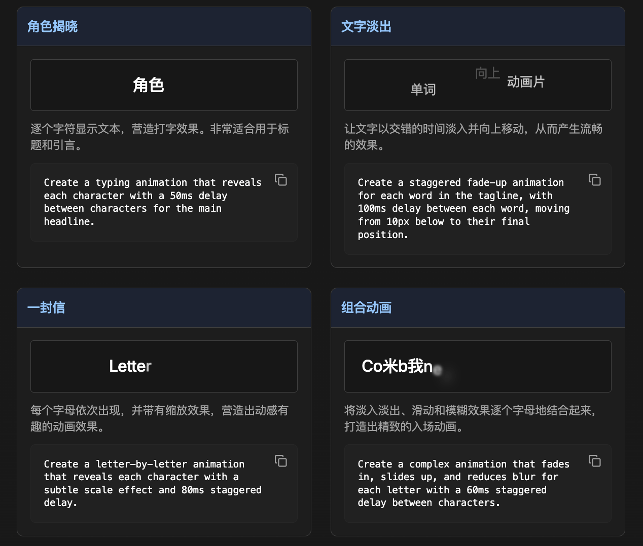
Create a typing animation that reveals each character with a 50ms delay between characters for the main headline. Create a staggered fade-up animation for each word in the tagline, with 100ms delay between each word, moving from 10px below to their final position.
Create a letter-by-letter animation that reveals each character with a subtle scale effect and 80ms staggered delay.
Create a complex animation that fades in, slides up, and reduces blur for each letter with a 60ms staggered delay between characters.
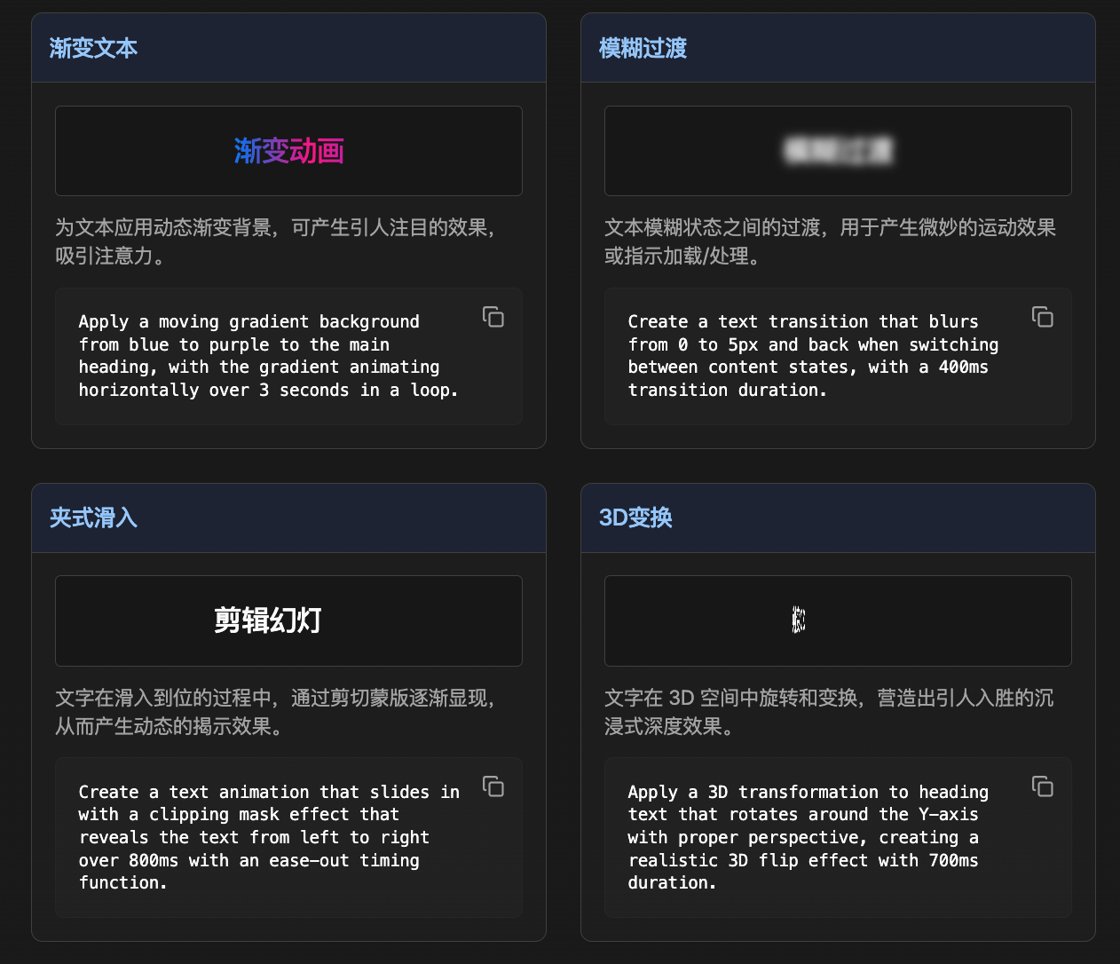
Apply a moving gradient background from blue to purple to the main heading, with the gradient animating horizontally over 3 seconds in a loop.
Create a text transition that blurs from 0 to 5px and back when switching between content states, with a 400ms transition duration.
Create a text animation that slides in with a clipping mask effect that reveals the text from left to right over 800ms with an ease-out timing function.
Apply a 3D transformation to heading text that rotates around the Y-axis with proper perspective, creating a realistic 3D flip effect with 700ms duration.
-- 2.卡片动画
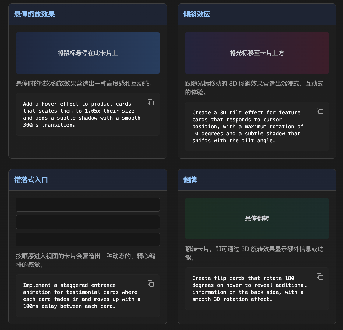
Add a hover effect to product cards that scales them to 1.05x their size and adds a subtle shadow with a smooth 300ms transition.
Create a 3D tilt effect for feature cards that responds to cursor position, with a maximum rotation of 10 degrees and a subtle shadow that shifts with the tilt angle.
Implement a staggered entrance animation for testimonial cards where each card fades in and moves up with a 100ms delay between each card.
Create flip cards that rotate 180 degrees on hover to reveal additional information on the back side, with a smooth 3D rotation effect.
-- 3.按钮动画
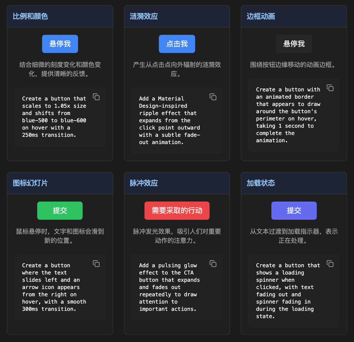
Create a button that scales to 1.05x size and shifts from blue-500 to blue-600 on hover with a 250ms transition.
Add a Material Design-inspired ripple effect that expands from the click point outward with a subtle fade-out animation.
Create a button with an animated border that appears to draw around the button's perimeter on hover, taking 1 second to complete the animation.
Create a button where the text slides left and an arrow icon appears from the right on hover, with a smooth 300ms transition.
Add a pulsing glow effect to the CTA button that expands and fades out repeatedly to draw attention to important actions.
Create a button that shows a loading spinner when clicked, with text fading out and spinner fading in during the loading state.
-- 4.警报动画
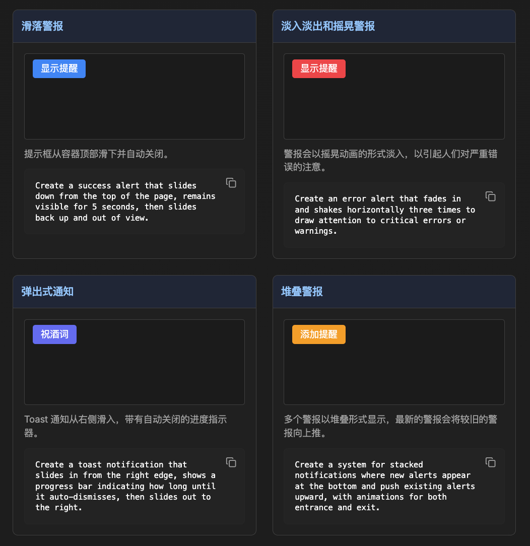
Create a success alert that slides down from the top of the page, remains visible for 5 seconds, then slides back up and out of view.
Create an error alert that fades in and shakes horizontally three times to draw attention to critical errors or warnings.
Create a toast notification that slides in from the right edge, shows a progress bar indicating how long until it auto-dismisses, then slides out to the right.
Create a system for stacked notifications where new alerts appear at the bottom and push existing alerts upward, with animations for both entrance and exit.
-- 5.动画时序
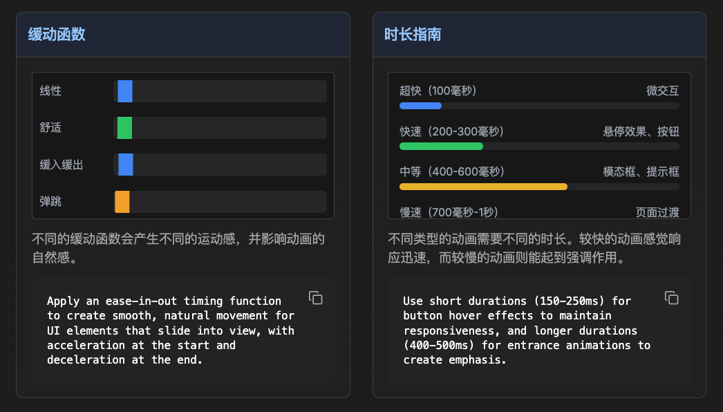
Apply an ease-in-out timing function to create smooth, natural movement for UI elements that slide into view, with acceleration at the start and deceleration at the end.
Use short durations (150-250ms) for button hover effects to maintain responsiveness, and longer durations (400-500ms) for entrance animations to create emphasis.
--
6.使用实例
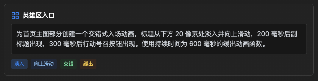
首页区入口
Create a staggered entrance animation for the hero section where the heading fades in and slides up from 20px below, followed by the subheading 200ms later, and finally the CTA button 300ms after that. Use an ease-out timing function with a 600ms duration.--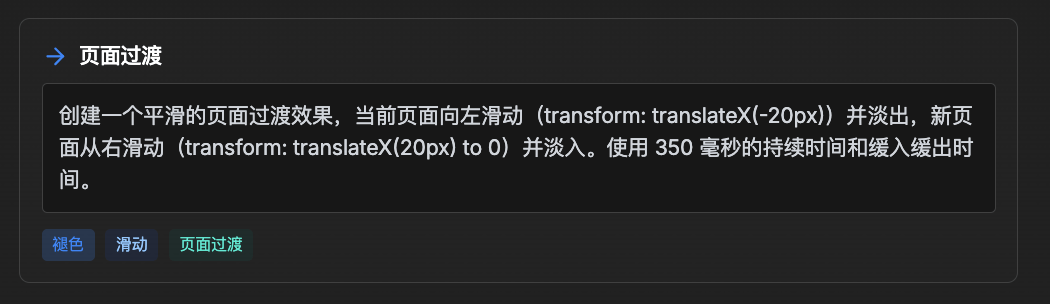
页面过渡
Create a smooth page transition effect where the current page fades out while sliding slightly to the left (transform: translateX(-20px)), and the new page fades in while sliding from the right (transform: translateX(20px) to 0). Use a 350ms duration with ease-in-out timing.--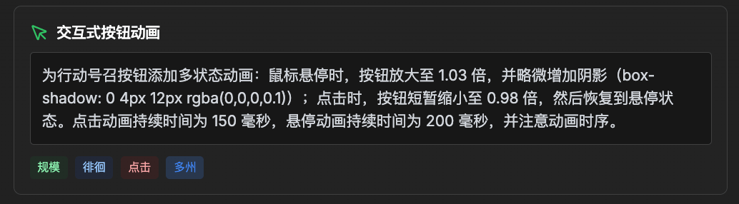
交互式按钮动画
Add a multi-state animation to call-to-action buttons where on hover, the button scales to 1.03x with a subtle shadow increase (box-shadow: 0 4px 12px rgba(0,0,0,0.1)), and on click, it scales down to 0.98x momentarily before returning to hover state. Use a quick 150ms duration for click and 200ms for hover with ease timing.--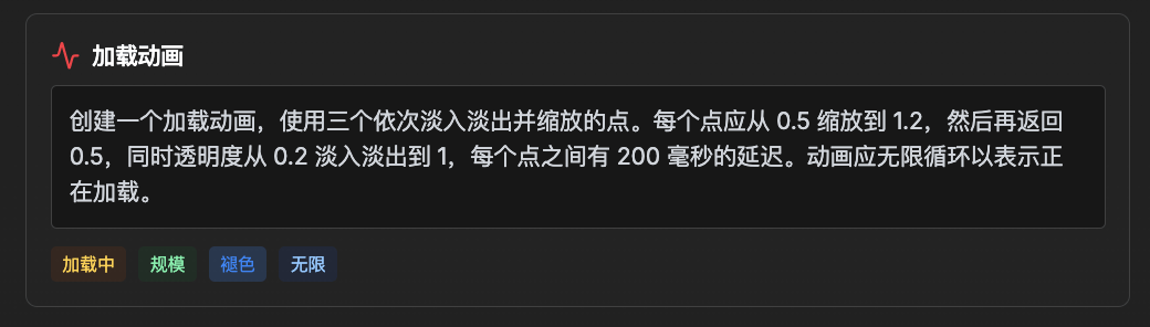
加载动画
Create a loading animation using three dots that fade and scale in sequence. Each dot should scale from 0.5 to 1.2 and back while fading from 0.2 to 1 opacity, with a 200ms delay between each dot. The animation should loop infinitely to indicate ongoing loading.--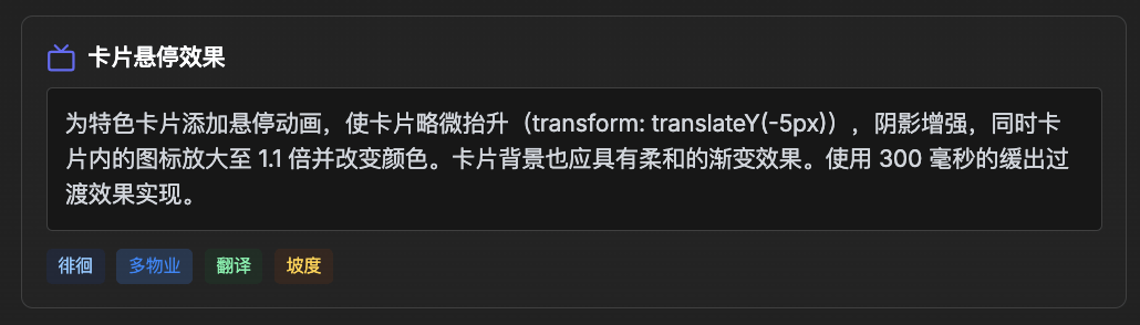
卡片悬停效果
Add hover animations to feature cards where the card subtly elevates (transform: translateY(-5px)) with an increased shadow, while the icon within the card scales up to 1.1x and changes color. The card background should also have a subtle gradient shift effect. Implement with a 300ms transition using ease-out timing.--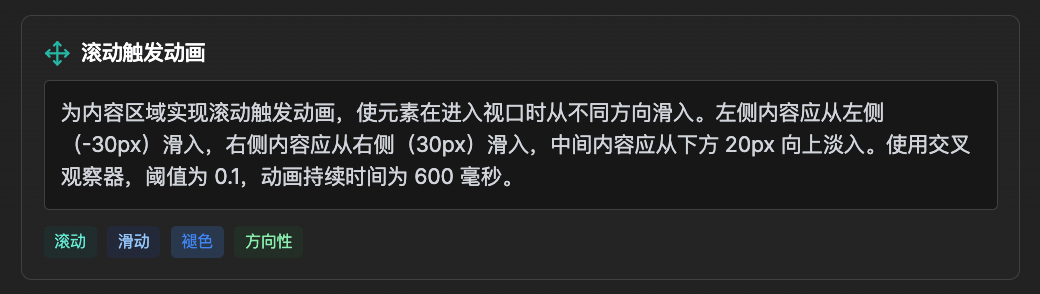
滚动触发动画
Implement scroll-triggered animations for content sections where elements slide in from different directions as they enter the viewport. Left side content should slide in from left (-30px), right side content from right (30px), and center content should fade in while moving up from 20px below. Use Intersection Observer with a 0.1 threshold and 600ms animation duration.
结尾这期我把优先级较高的提示做了汇总,有一部分没有提及「不是不重要,实在是这位制作团队写的太详细了」我们下期在汇总剩下的部分「布局提示以及怎么转换成Json文件」。


评论区 (0)
最新评论登录后发布评论并参与互动。
暂无评论,欢迎抢沙发。